ShopDreamUp AI ArtDreamUp
Deviation Actions
Phil Cho Super Fans
50 Subscribers
Get access to exclusive artwork including sketches, inks, and high definition pieces here :)
$10/month


Suggested Deviants


Suggested Collections


You Might Like…


Featured in Groups


Description
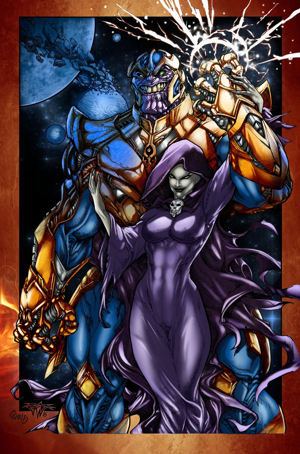
lines by 
Inks by
Colors by Me!
Inks by
Colors by Me!
Image size
4140x6264px 4.95 MB
© 2017 - 2024 Crayola-madness
Comments5
Join the community to add your comment. Already a deviant? Log In
Hi.
I'm not very eloquent today, so sorry if it's not very well written or as detailed as I'm used to.
Here's my two cents: The palette is fine. The problems I see are: The blue colour of Thanos and the blue of the bg are the same, which doesn't contribute to separating the two planes.
*You use the same colour for all the dress, for instance. You should use more colours for the same object. Look at mine, as an example. I used yellow, red, green, and touches of hot pink.:origin()/pre00/47f3/th/pre/i/2017/173/0/2/thanos_and_mistress_death_erasing_planets_by_ivannamatilla-dbdmv4r.png)
*Try not to use white for lights and black for shadows. You can choose complementary colours, or variations in temperature. Look at this awesome example::origin()/pre08/baae/th/pre/f/2013/136/a/6/fishing_by_marcobucci-d65gja0.jpg)
*Get rid of blurry brushes. Use sharp edges for cast shadows. Show some contrast.
Finally: Variation is the key. Same bruses: boring. Same colour: more boring. Look at this nesskain.deviantart.com/galler…
You'll feel like your work is the worst ever after looking at this guy's gallery. I do. But you'll see what I mean.
I hope it was useful!
I'm not very eloquent today, so sorry if it's not very well written or as detailed as I'm used to.
Here's my two cents: The palette is fine. The problems I see are: The blue colour of Thanos and the blue of the bg are the same, which doesn't contribute to separating the two planes.
*You use the same colour for all the dress, for instance. You should use more colours for the same object. Look at mine, as an example. I used yellow, red, green, and touches of hot pink.
*Try not to use white for lights and black for shadows. You can choose complementary colours, or variations in temperature. Look at this awesome example:
*Get rid of blurry brushes. Use sharp edges for cast shadows. Show some contrast.
Finally: Variation is the key. Same bruses: boring. Same colour: more boring. Look at this nesskain.deviantart.com/galler…
You'll feel like your work is the worst ever after looking at this guy's gallery. I do. But you'll see what I mean.
I hope it was useful!